Thomas Gutteridge. Six Years, 600 Labels: Building Phantom Brewing's Visual Identity One Can at a Time.
Illustrator Thomas Gutteridge spent six years designing the visual identity for Bristol craft brewery Phantom, producing over 600 beer labels, a handful of murals, and a brand that became instantly recognisable across the UK. We sat down to talk about how it all started with three labels for a bloke's 50th birthday.
When Thomas Gutteridge first got the call from Phantom Brewing, the brief was simple: three beer labels for a small private commission. The brewery itself was tiny, with two knocked-through warehouse spaces, a handful of limited-run beers, and a placeholder logo that was, by Tom's own assessment, "just the silhouette of a bottle."
He didn't stick to the brief.
"I saw the logo and I was like, is that your logo? They said yeah, it's just a placeholder. I said oh come on, let me update that for you!"
That instinct to go beyond the ask turned a three-label job into a six-year creative partnership and one of the more prolific body-of-work stories in independent UK craft beer design.
Building a Brand Without a Brand Process
The process to build the Phantom Brand wasn’t what you might typically expect. There wasn’t a kick off call or discovery phase, or a deck full of moodboards to suggest visual directions. Phantom's visual identity was built in motion, sketched out at the same pace the brewery was growing, often shaped by practicality as much as strategy.
"In an ideal world, I'd have approached the branding with a proper process," Tom says now, looking back. "But the way I was approached for the work, it was very ad hoc at the beginning. They just needed designs out, and that's what drove it."
The early logo had, in his words, "lots of needless bits on it." It was bottle-shaped, an irony that only became clear later, since Phantom brewed almost exclusively in cans. The logo was simplified and emboldened in stages: first just before the brewery officially opened in 2019 (Tom went to the soft launch and saw it everywhere, "thank god I did that"), then again when it became clear the mark needed to hold up at scale on packaging.
"We realised it needed to stand out more. So we made it bolder, simpler to look at. It evolved over time as we figured out how it needed to develop."
The ghost was always in there, a minimal droplet form and a quiet nod to the name. It turned out the founders had named the brewery after their very first home brew: Phantom of the Hopera. Which Tom found faintly amusing, given the brand's strict no-pun policy on beer names.
"We found cheesy pun names kind of lame. So I always thought it was quite funny that's where the name came from. But it's a nice little link-up."
600 Labels. Roughly 100 a Year. No Slowing Down.
The numbers are difficult to contextualise until you try. One hundred labels per year means two every week, for six years. Each one required a concept, a sketch, client sign-off, final artwork, and files sent to the printer, all within a one-to-two-day window. Total turnaround from idea to finished can: about two weeks.
Tom ran the whole thing through a WhatsApp group: himself, the two founders, and Rachel, the operations manager, who had a particular gift for catching typos before they went to print.
"The sketch stage was always the hardest bit. Sometimes it'd go through first time, and other times we'd have a bit of back and forth. About 50/50 whether the first idea landed. But then the rest of the process was fairly streamlined, due to the need for the label to be ready for freshly brewed beer!"
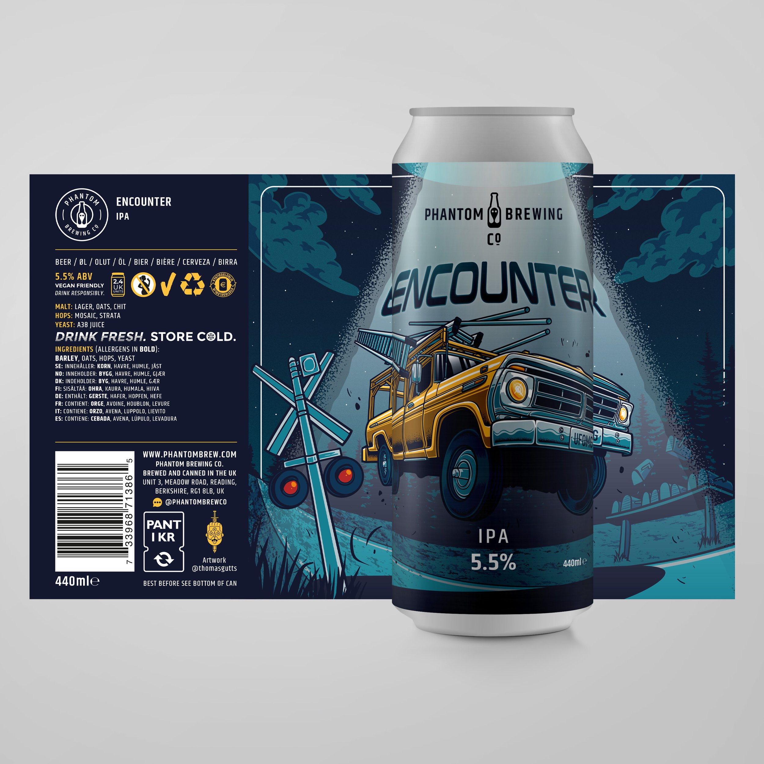
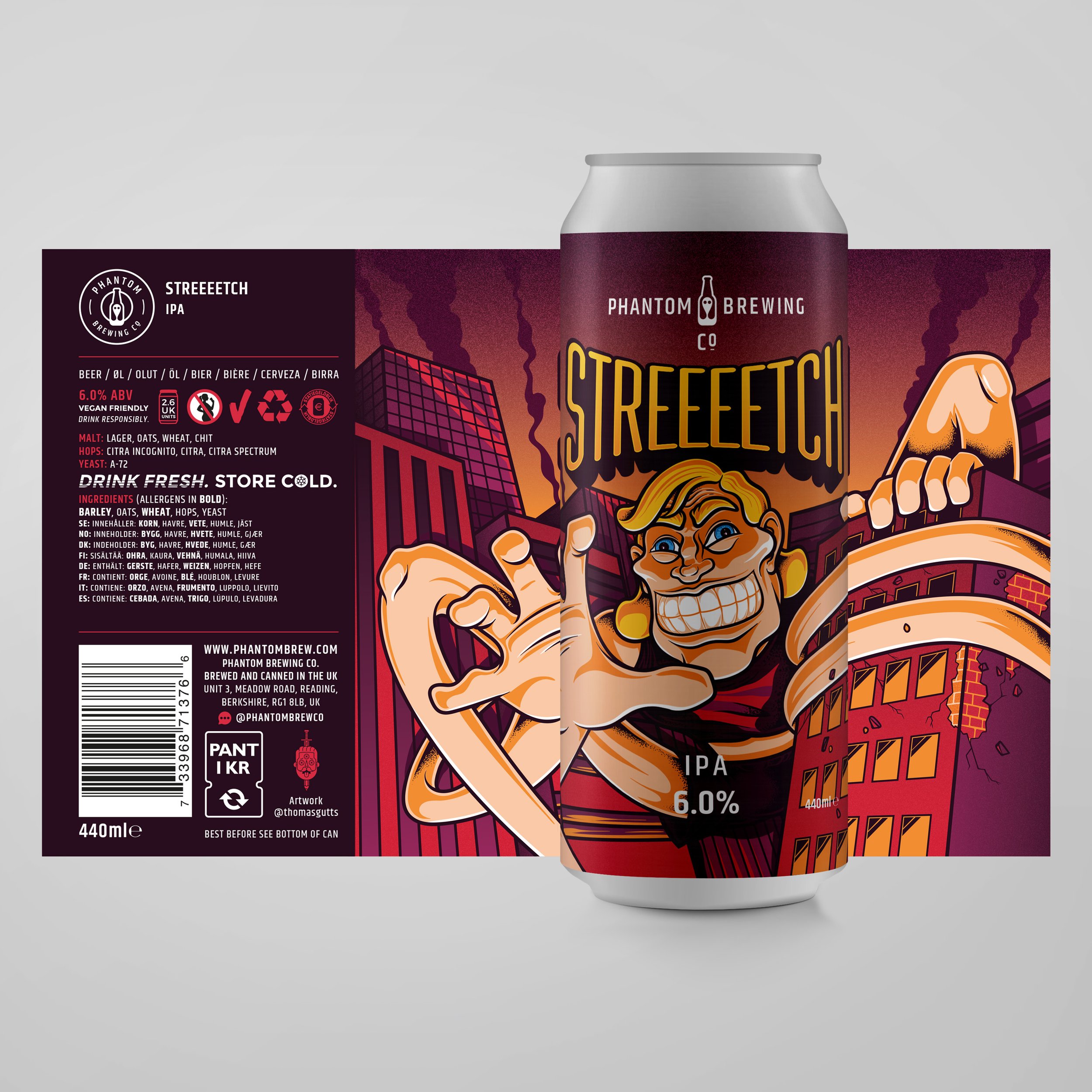
What made the pace possible was a strict template. Logo position locked. Beer name space locked. ABV and style on the front. All technical information on the side panel in a block of colour. Within that frame, the artwork could go anywhere.
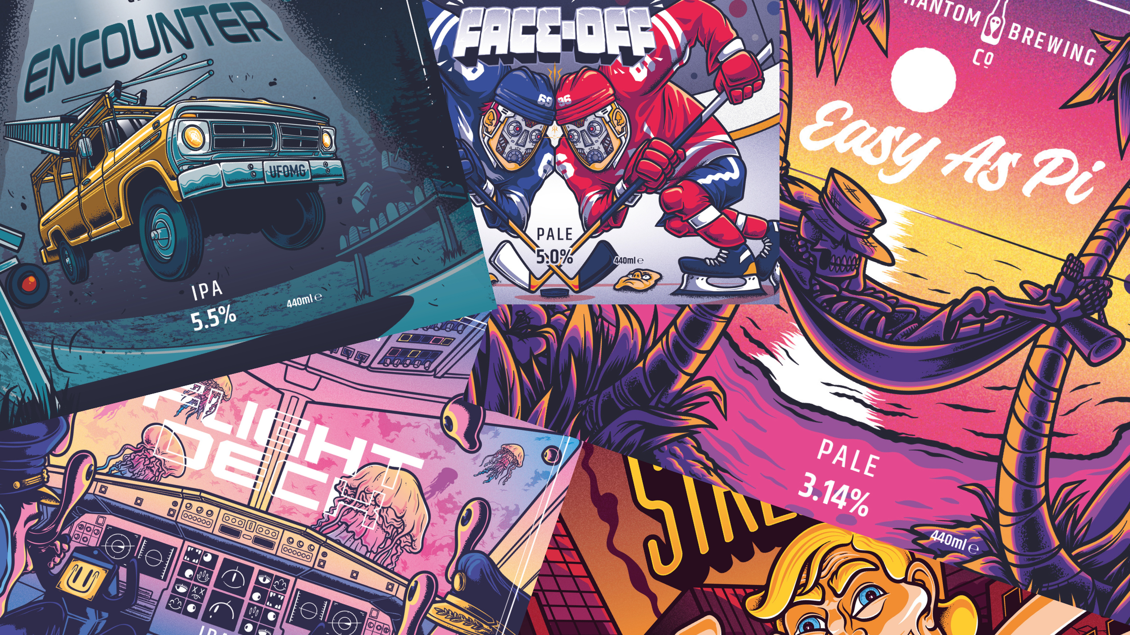
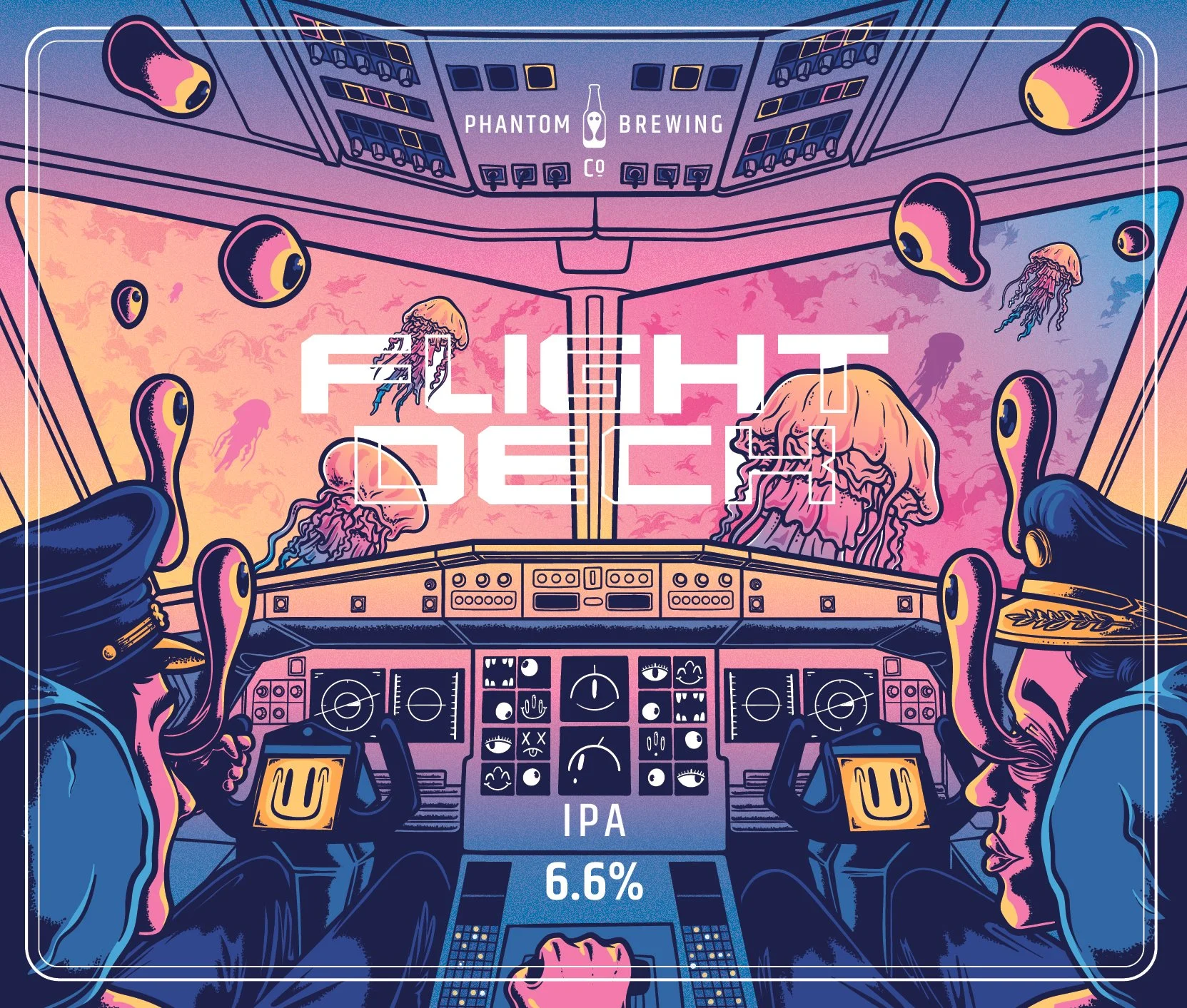
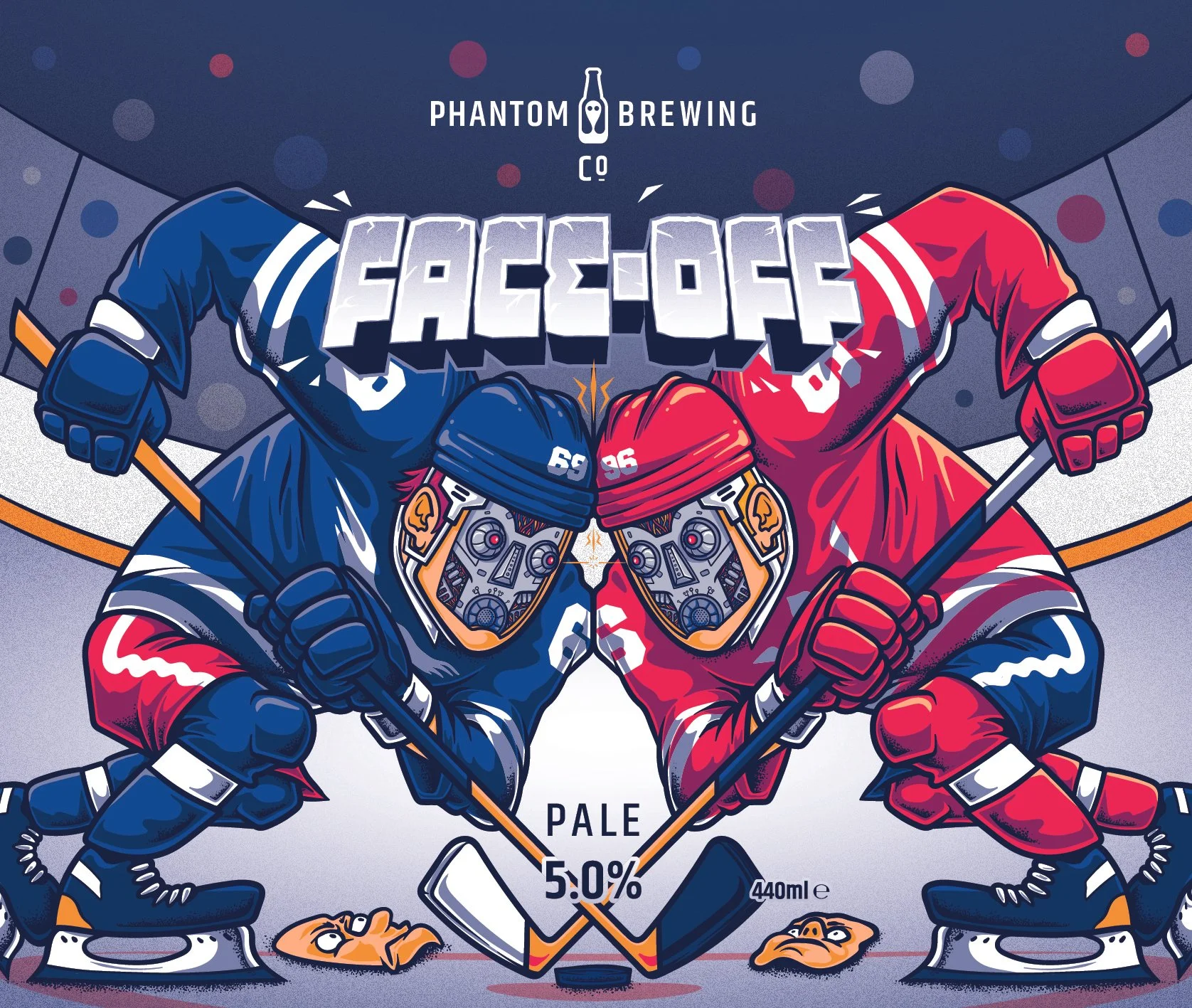
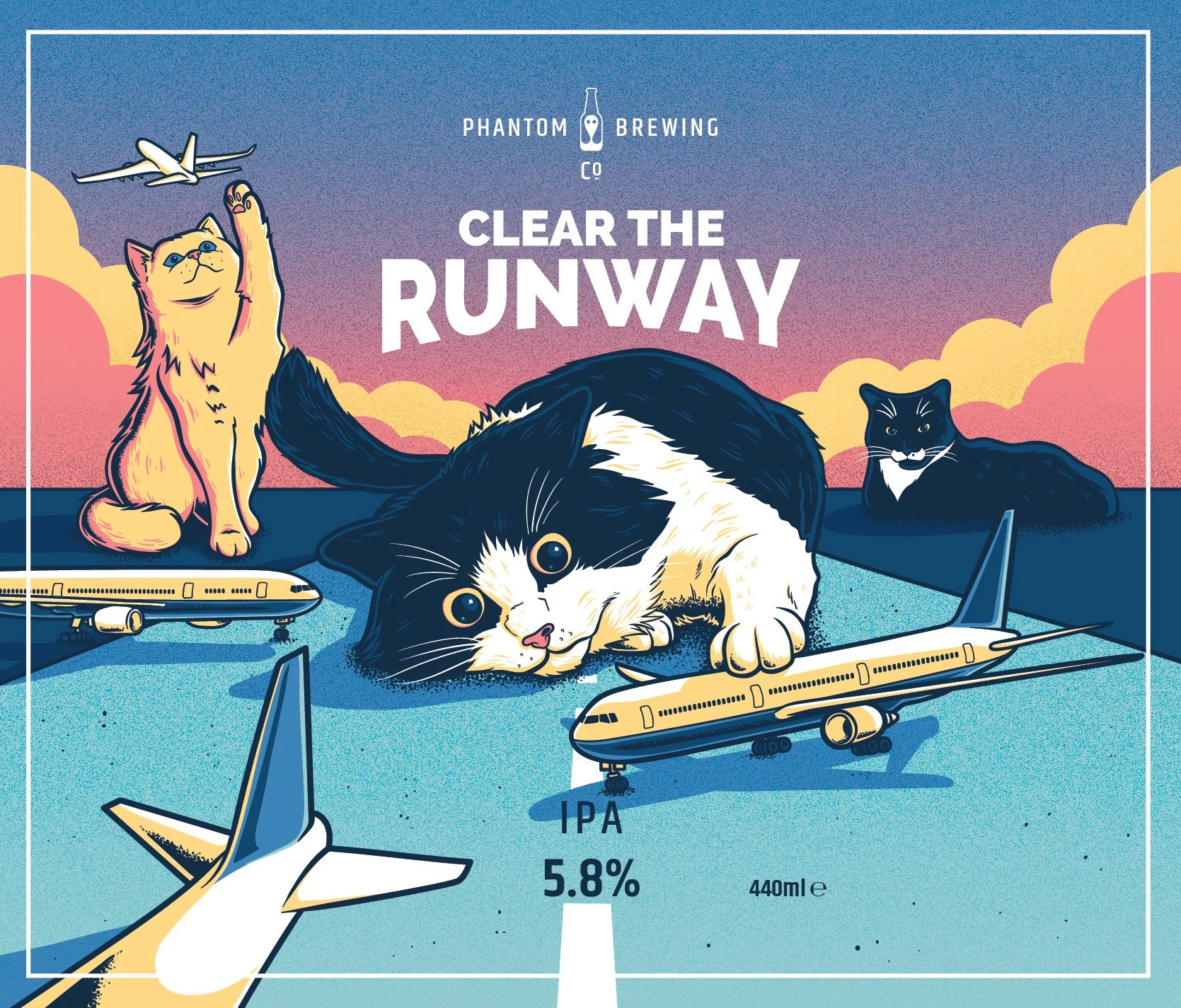
And it did. Over 600 labels, the visual language stretched into alien abductions, giant animals striding through cityscapes, toy-inspired characters, fisheye-lens perspective pieces. The brand's pop punk DNA, rooted in the founders' devotion to Blink 182, sat underneath all of it.
"What made the brand was the personality of the people behind it. We were just being ourselves. They approached me because they liked what I did, so I had the freedom to create the artwork I love the most."
The Ones That Stuck
Ask Tom to pick favourites from 600 and he'll qualify the question a few times before settling on three, each memorable for a different reason.
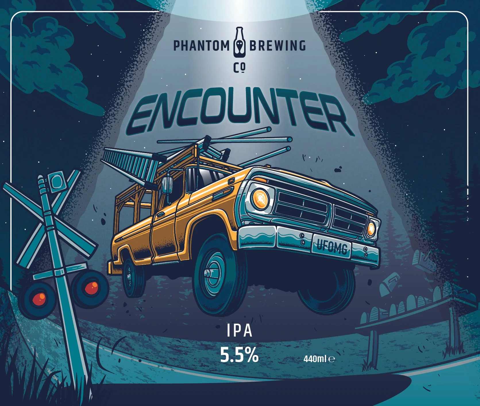
Encounter, a Close Encounters of the Third Kind reference, earns its place for the illustration itself: a low, fisheye perspective of a van being lifted by aliens, drawn from an angle Tom hadn't seen in other Close Encounter illustrations.
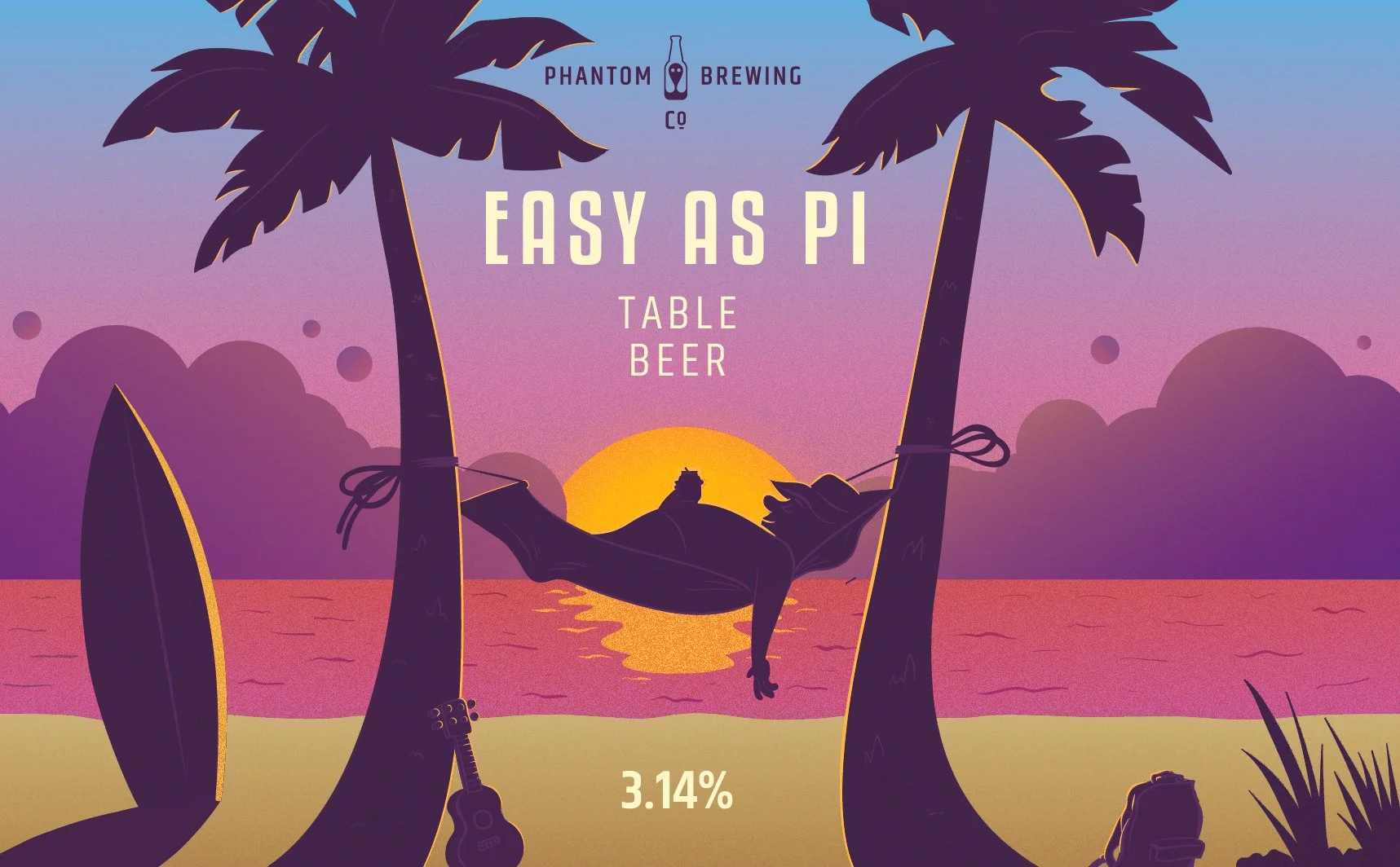
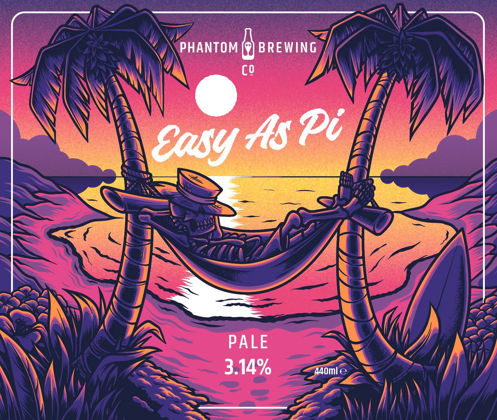
Easy As Pie makes the list for what it represents as much as the artwork itself. It was one of the original three labels, commissioned for that 50th birthday party. Years later, he redrew it. Placing them side by side became a direct measure of how far he'd come.
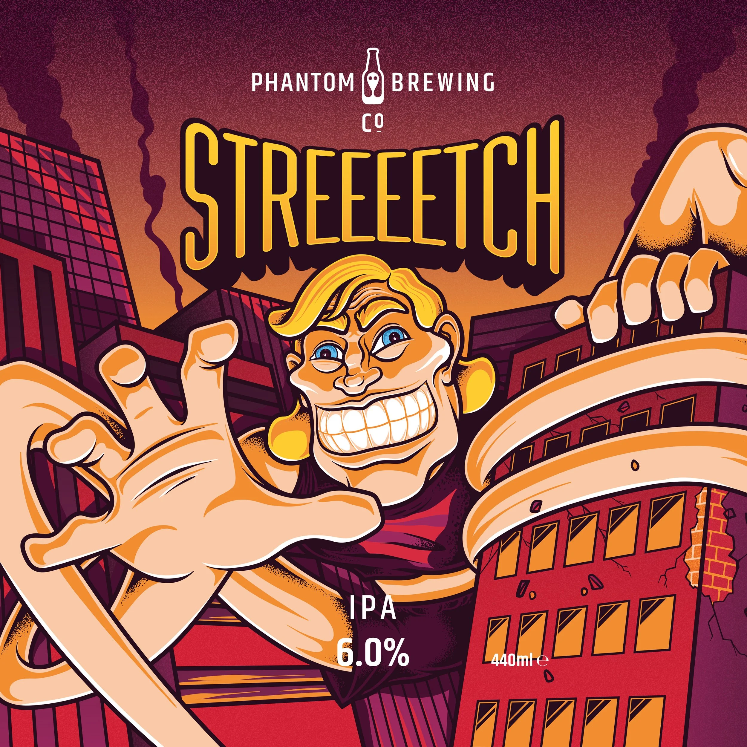
Stretch is the one that almost wasn't. The original sketch, a Stretch Armstrong figure on the front of the can, got approved. Halfway through execution, Tom hated it. He went back to the drawing board and came back with something different: a giant Armstrong figure striding through a city, arms wrapped around skyscrapers, somewhere between pop art and Attack on Titan.
"I'm much happier with that compared to the original. Each of those have different reasons for being my favourites."
What Murals Taught Him About Scale
Expanding into murals should have been a natural extension. In practice, it required learning a different discipline entirely.
"What I've learned is you can't just do what you'd do for a can. The transition in size is crazy different. On a mural, what looks better is less. Which is weird, because you've got a bigger canvas, and it's easier to make it look bad if there's too much going on."
The first two murals at the brewery were handed to other mural painters, which in the end Tom regretted, seeing certain elements he'd have done differently.
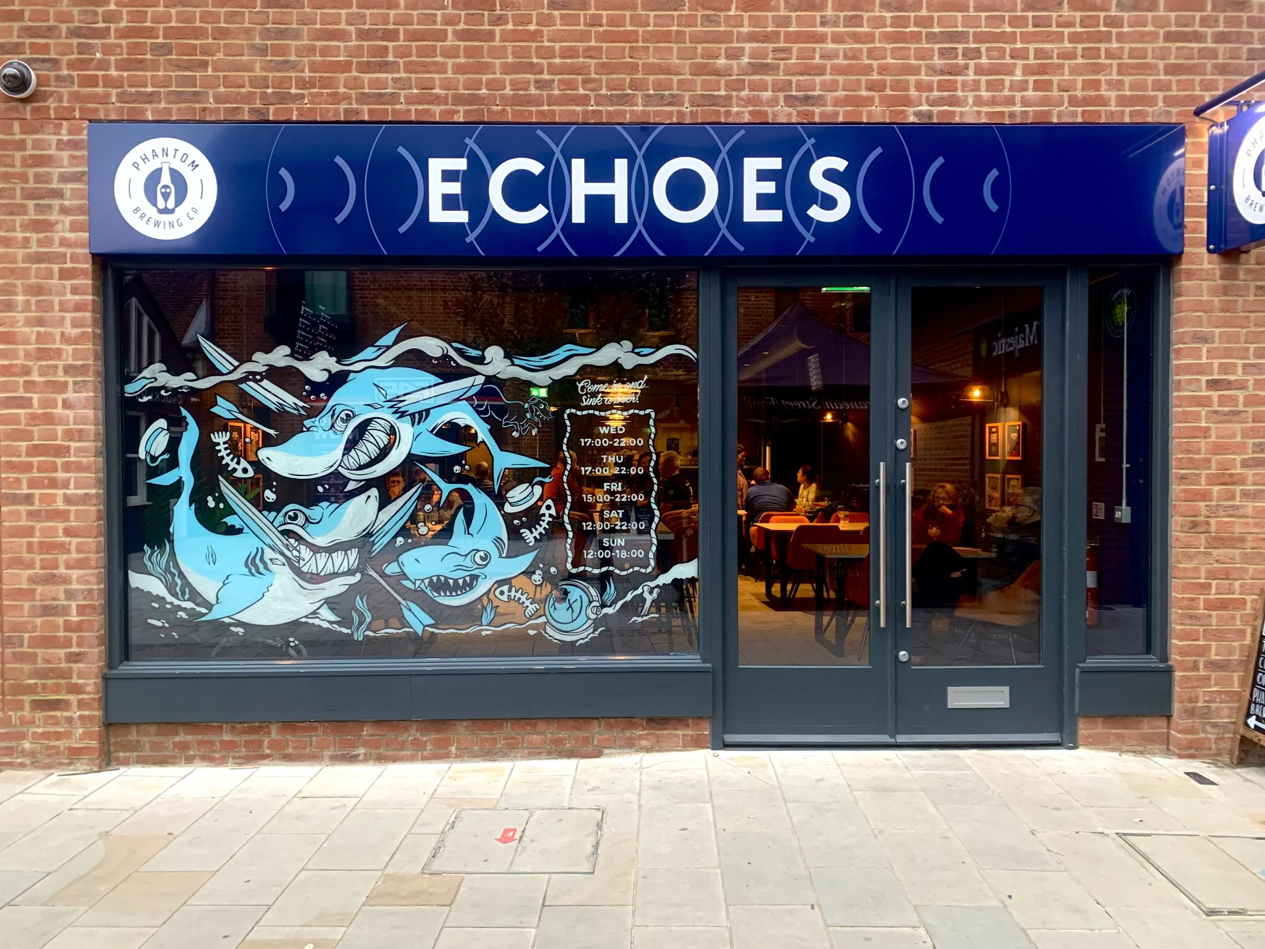
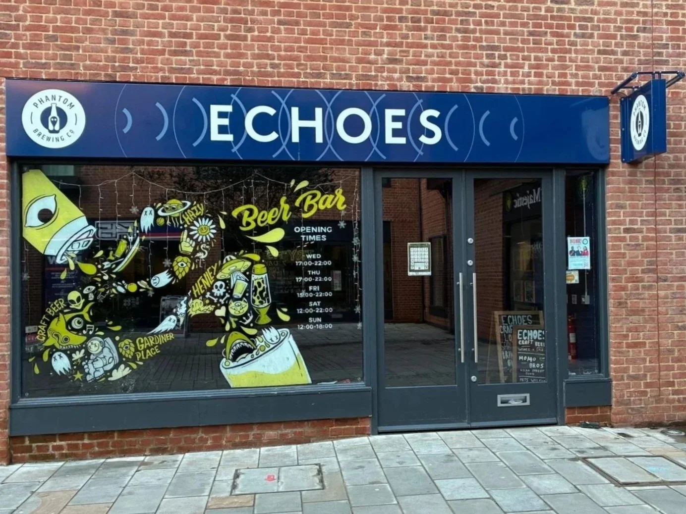
"Moving forward I wanted to be more involved in making sure the artwork was done how I imagined it, starting with the windows at the second venue - Echoes the bar in Henley - I was always doing those myself.”
It's a consistent thread across the whole six years: the things that worked were the things he controlled directly, trusted his eye on, and was willing to go back and redo.
Now
Phantom closed that chapter. Tom is back to full-time freelance in Bristol, and by his own account the transition is going better than expected, with enough incoming work that he hasn't had time to do any business development yet.
He wants to work with another brewery. He'd love mural commissions. Bristol, he notes, has extraordinary site work everywhere, and he wants to be part of that. Clothing, poster design, food and drink brands. And he wants to build out his own brand properly: sharper messaging, a clearer position.
"I just want a steady flow of work, and to develop my brand a bit. Mine's just a logo at the moment. I want to position myself better."
Six years and 600 labels in, the positioning shouldn't be too hard to find.
Work with Tom
Tom is part of the Tone Def. collective, where we help brands develop their creative strategy and brand presence, and we'd love to connect him with his next great project. You can find his portfolio on our site here.
He's a natural fit for drinks brands, breweries, and anyone operating in food and beverage. But the truth is, his skill set travels. If you're a brand that needs a distinctive visual identity, an illustrator who can hold a consistent world across hundreds of touchpoints, or someone who brings genuine personality to packaging, print, and large-format work, Tom is worth a conversation.
Whether you have a defined brief or are just looking to explore the art of the possible with your brand design, Tone Def. can help. We work closely with marketers and business leaders to develop creative briefs and ideas, as well as producing and managing projects alongside them. If you have a project in mind and would like to talk, get in touch at mark@tone-def.co.uk and tell us what you're working on.